


Mrs&Mr Captures Transformative Essence of Tabasco with a Hot New Brand ID


Creative agency Mrs&Mr has created the first visual identity system for TABASCO Brand that is rolling out across all communications globally. The new look blends familiar brand elements with bold new graphics - including animation - to instantly telegraph the brand’s legendary status and singular ability to ignite and amplify flavours across all cultures and cuisines.
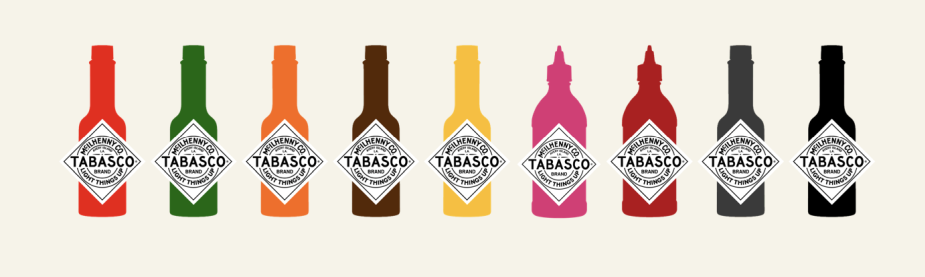
The new visual system celebrates the iconic TABASCO Brand bottle shape and label and creates a visual vocabulary that both literally and figuratively interprets a new tagline, “Light Things Up”. The design utilizes vibrant, energetic illustrations, graphic elements and food photography instead of predictable flames and explosions to communicate its transformative power and creates a clear system to highlight individual flavors. The identity needed to also offer a way to tell the brand’s heritage and be versatile enough to adapt to a range of mediums and usages.
TABASCO - Brand Story from Mrs&Mr on Vimeo.
“Giving things kick and heating things up is a category table stake—TABASCO Brand does so much more. Its unique strength is that it makes everything it touches more original. Some of the most distinctive people in the world are passionate about TABASCO® Brand from chefs to celebrities to astronauts to royalty,” said Kate Wadia, founder & CCO at Mrs&Mr. “It has been a beacon for original people and tastemakers for more than 150 years and we celebrated this essence with a dynamic, contemporary visual system that keeps the iconic bottle and diamond logo central to every communication.”
The global nature of the brand requires a visual-first language-agnostic system that is easy to adapt to local marketing needs. New style elements include a refresh to the iconic TABASCO Brand diamond logo, a new bottle treatment with a pronounced diamond logo to enable branding communication and flavor differentiation and a halftone bottle that provides a more hand-made, illustrative feel.
In addition to the dynamic graphic style, the new system includes verbal icons, a refreshed colour palette, new typography, and an updated, arresting and appetizing approach to food photography. A clear set of design rules makes the templated system both turnkey and scalable to provide literal building blocks for campaign supporting any activation, flavor or holiday anywhere in the world.


